

I know the rest of the world sometimes find us designers maddeningly dizzy, but we are busy seeing things all the time. In collaboration with each other, we hardly need say a word. Once a nervous producer told the lighting designer Dennis Parichy and me that they were looking for a lighting designer and set designer who could collaborate. As we had by that point done about 25 shows together we thought it would be obvious that we collaborated—but “acting out“ collaboration between two designers was quite difficult for us as we barely spoke about our work to each other — we communicated by other “designer” means. I designed with him, he designed with me, we designed for each other. We saw things together and we saw things separately.
I usually design for and with, the other designers. I really like to know exactly who is going to light the show so I can design with them in mind. Set designers usually are brought into the process first, so we lead in the beginning, but are totally dependent on the other designers when they join in to collaborate. Not that you could necessarily see this process happen. It can be that instinctive.
One frequent collaborator, costume designerJane Greenwood, and I were well known for never having color clashes. This woman can use the color words “Eau de Nil” and “Ash of Roses” in a sentence without blinking. We have a designer communication without words. Once, on a rushed production, we were both hauled onto the stage, thinking there was a problem, and were surprised to be congratulated on our inspired color work on a kitchen scene set in the sixties. As we exited the stage we both were guiltily astonished as we had never discussed the scene together but had instinctively balanced each other’s work, using variations of the same three colors.
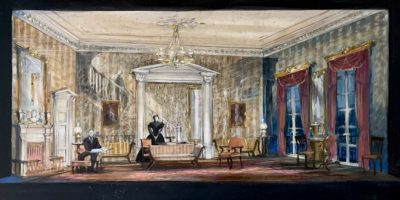
On another show, House and Garden I warned Jane that I had designed a Naples yellow room, so she should probably stay away from yellow. She countered by successfully placing the leading lady in a series of yellow costumes to prove to me that yellow can be manipulated to work in more ways than I ever imagined. I smiled in deference to my collaborator.
ORIGINAL SKETCH BY JOHN LEE BEATTY
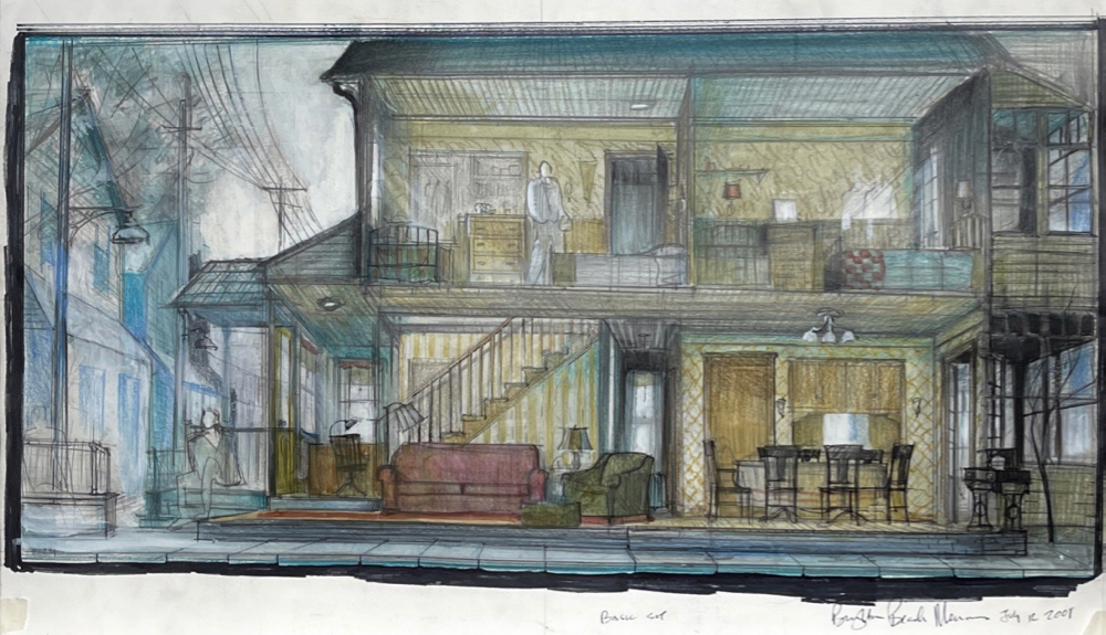
The only argument I have ever had with Jane Greenwood was about “ecru” and “parchment.” For the revival of Brighton Beach Memoirs there was a tablecloth, and there was a wall behind a “thirties” lady wearing an ecru lace collar. There was much confusion amongst the others on the production about what the hell was going on with us, as Jane and I were usually so very tight and friendly. I thought the tablecloth should be darker. She wasn’t sure. She thought the wall behind an actor was a disaster, lighter ecru than the actor’s collar. I dug in. We sulked. We stopped speaking. And yes, outsiders might laugh about this, and make jokes about us arguing over “puce” and “aubergine,” but the designer’s eye is both a boon and a curse. Neither of us could unsee the wheat/ecru balance problem, so obviously important to us personally, but invisible to the others. And we had to visually protect the actors from our color malpractice, and not disturb the director, unbeknownst to them. Peace and rapprochement was reached —after a week or two, and some judicious dyeing and repainting. Don’t mess with ecru.
Enlarge
Enlarge
ORIGINAL SKETCH BY JOHN LEE BEATTY
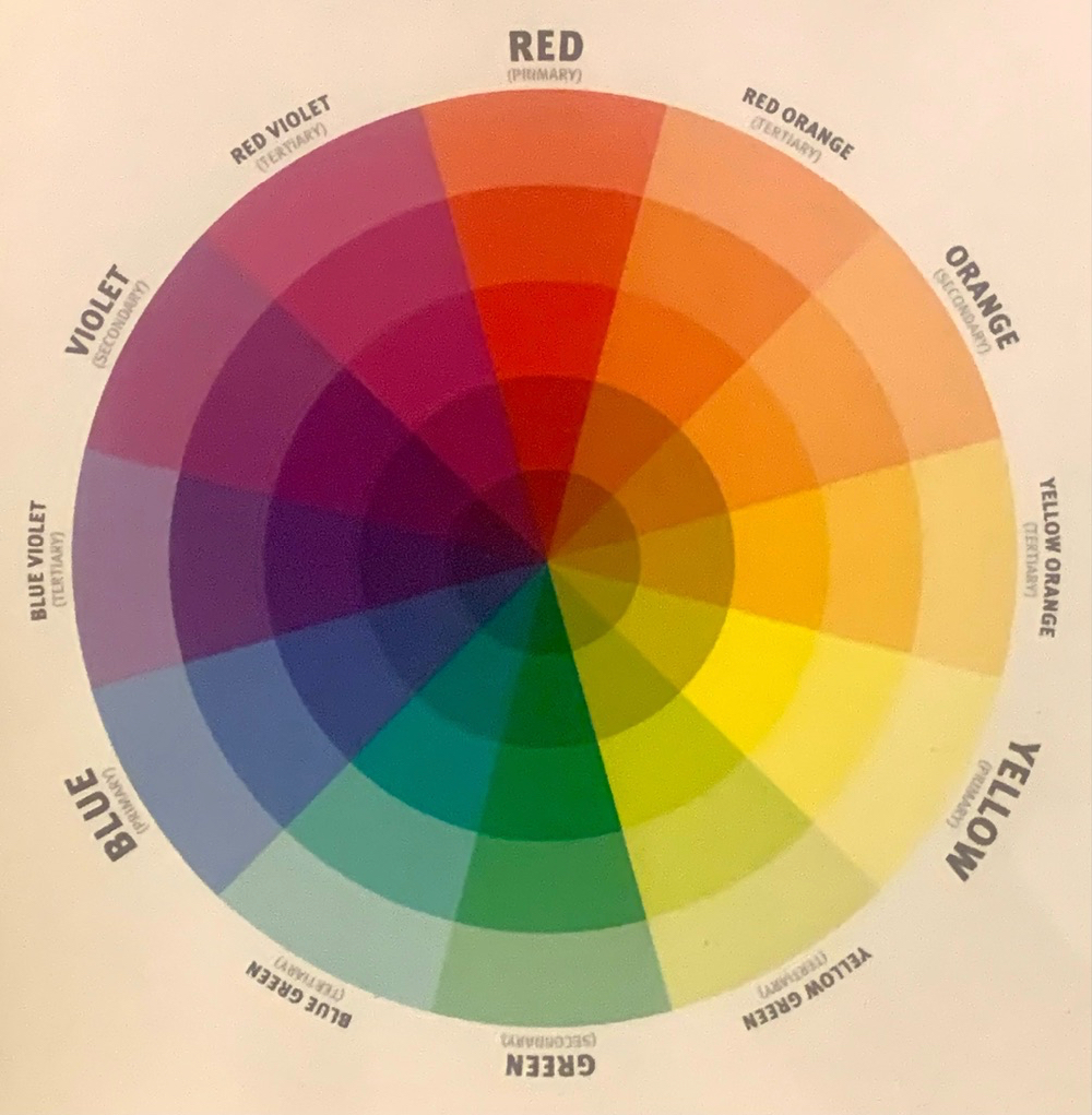
My favorite Jane Greenwood moment was when she announced that a ballgown in a play’s climactic scene obviously must, must, must be bright red. The director immediately countered that the leading actress and he had discussed it privately and decided that it would be green. Jane immediately replied “Well, then, of course GREEN! “ The director affectionately mocks Jane for her silly lack of backbone in the discussion, but she and I have a “color wheel” in our heads. I have one on my wall as I write. To me, the joke was on the director — Jane didn’t agree to beige or yellow, as what is the direct opposite of red on the wheel but that bright true green? The designer eye knew that doing the opposite was the same impulse, not a weaker or off-balance choice. To a designer’s color eye, she actually won … Look at the wheel! And for the same reason, if one has to choose between black and white, gray is not the compromise solution. Gray to me is just dead elephants. Choose something else that isn’t a compromise.
Enlarge
I once took the Lüscher Color Preference Test, where flash cards of colors are exposed to you lightning fast, and you are supposed to pick your preference at the same speed. I love all colors, some more in my private life, some in my professional life, like the sick yellow green that makes all us WASP “pink” people look healthy if painted as a background. Well, the Lüscher cards are flying past and I stop short — five colors to choose amongst quickly, and one of them is blue. I love blue and wear it often, but this particular blue I couldn’t choose, as it was a dirty “green blue.” DOA. Well, my designer mind is asking if this shade was a printing problem, as I know that blue is volatile in printing, or was that particular tone intentionally made unattractive for the psychological reasons the scientists were researching? Was I supposed to pick it for my preference for blue, or my preference for the particular tone of blue? I stopped the test, as I knew that one wrong color choice led to others and upset the entire scientific color applecart.
And then there was the three hour session with costume designer Patricia Zipprodt picking her white and my white for Alice in Wonderland — she had file cabinets with drawers and drawers of whites. And she was quite naughty, as her white as it eventually appeared on stage was just a touch “whiter” than she promised, but not enough to be proven in a court of law, unless there was a designer court of law. On another show, Patricia stopped speaking to me entirely for one of my reds being more her idea of “Chinese” red than her expected “Russian” red.
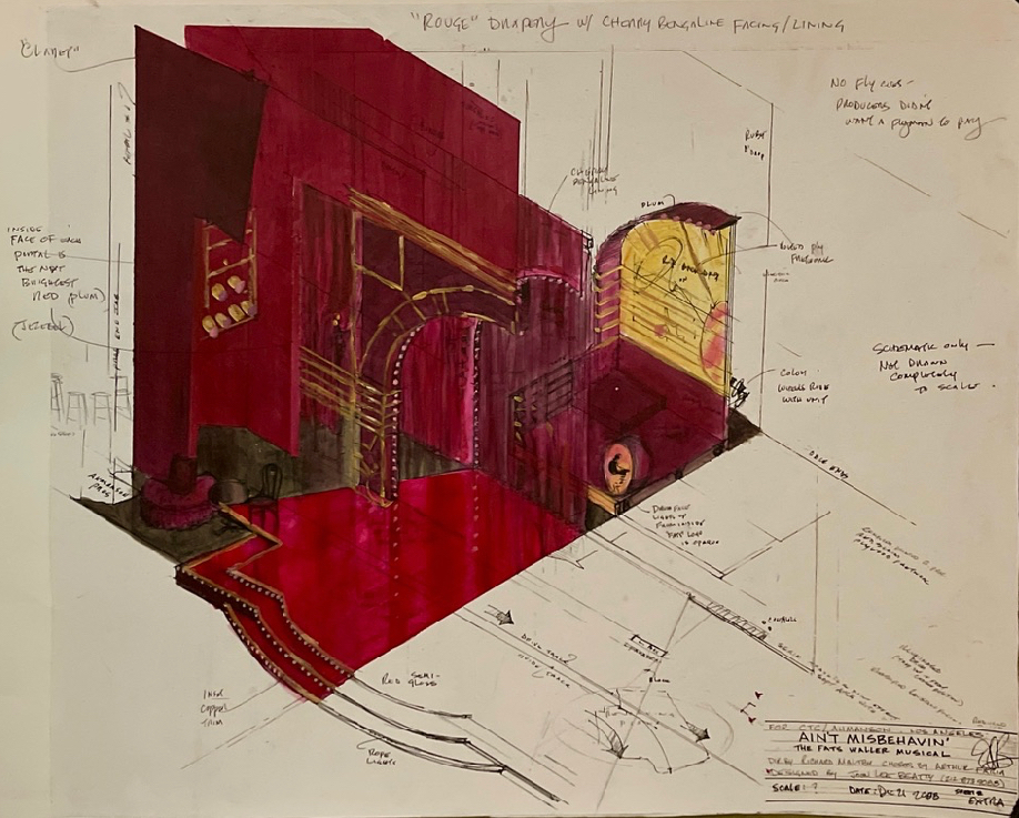
Ms. Zipprodt was quite interested in my design for the long-running Ain’t Misbehavin’ which had 8 shades of red together on stage. She blithely noted that of course Randy Barcelo, the wonderful costume designer had not used red. She opined that any color can be the “neutral” and in this case red was the “neutral”—and a very hot neutral it was—but was the “neutral“ nonetheless. It was a good neutral background for Black skin as well—Pat Collins’s chartreuse yellow green light calmed and richened the red, and made the actors’ skin glow a wonderful golden caramel.
Enlarge
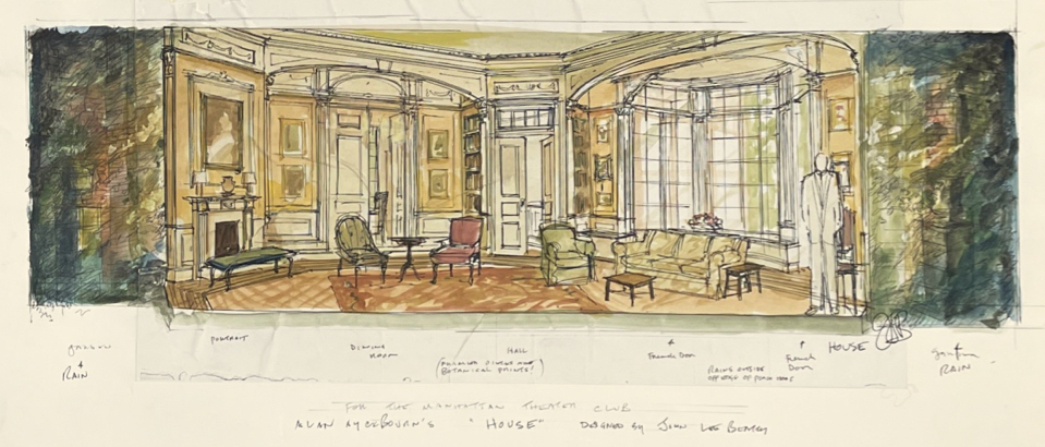
ORIGINAL SKETCH BY JOHN LEE BEATTY
I did a small number of shows with lighting designer Arden Fingerhut, a good designer, but we had the oddest color problem. Her taste in color and mine were the same, disastrously so. I would do a golden brown-hued set, and she would pick the same color to light it. You couldn’t find the actors unless they wore pale ice blue, thoughtfully provided by costume designer Jennifer von Mayrhauser. The next show Arden and I did, I manipulated my colors to be “off” from my instinctive choices, knowing she would have unconsciously matched me again. The lights came up and she told me proudly she had chosen different colors to “fix our problem.” Yes, she had adjusted them to be “off” exactly the same way I had! We were both being sensitive collaborators, but it took some time to repaint and relight the set nevertheless.
One of my favorite shop experiences as a designer was standing in the middle of the paints at Hudson Scenic studios. With painters of all different ethnic backgrounds and skin tones, we were sampling colors to see what would make our different skin tones look “good” or “bad”—absolutely fascinating, especially as the show we were painting—Good People—had a mixed cast. We were doing pure color work, learning from each other how make people look good.
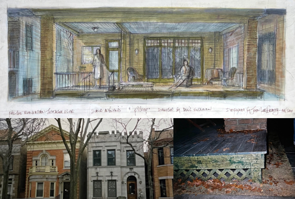
When I designed Rabbit Hole my first question to the director, Dan Sullivan was “What color is Cynthia Nixon’s hair going to be?” On Sex and the City she was a redhead, but she is known in the theater as a blonde. He came back to me with a firm, if amused answer to my seemingly fanzine question: definitely blonde. But indeed from the first, I built the entire production scheme around her being the leading color. Hey, and she won the Tony, so …
Enlarge
ORIGINAL SKETCH BY JOHN LEE BEATTY
A word of warning to designers, however. If the director doesn’t like wallpaper, there’s a pretty good chance they may be color blind. Don’t call them on it, but take note. It may be your opportunity to do an all gray or all white production! I would love to name names, but the designers’ code of ethics prevents.
But it’s not just color consciousness that can be a distraction. There are things a designer’s eye sees that cannot be ignored.
I used to study handwriting analysis, and am quite the believer. What designer wouldn’t believe that the drawing and writing hand reveals the personality? Doors designed by different designers reflect their own personalities, especially in proportion. Sometimes they actually are tall and thin, or shorter and wider, directly in proportion to who drew them. Certainly we unconsciously arrange a space to our own dimensions—I’m looking at you, Frank Lloyd Wright. I knew he was short the first time I entered Taliesin West. I didn’t have to ask. I recognize my own handwriting, as do you, probably. I recognize my own hand drafting, I recognize my paint style, I recognize my own doors! They look like me.
So many times I can’t remember someone’s name but I can recall what they were wearing. Director Dan Sullivan once teased me and said I didn’t remember the first time I met him. True I guess, but a moment later this designer offered: ”Sheared sheepskin coat, you didn’t take it off, sat in swivel easy chair, unhappily slouching.”
It was a bit of a joke in my hometown too, as I could recall people’s clothing, even particular dinette sets from the fifties. Or whether something had been changed in a room.
While working at the Oregon Shakespeare Festival (OSF) on my last day, I asked to go into the archives room. There was a Merchant of Venice in my visual memory that I couldn’t identify. Those three suitors’ very particular metal caskets lingered in the backwaters of my memory. I‘ve seen the show five times and designed it twice, yet there was a lurking memory of a production of Merchant of Venice left unidentified in my head. I discovered, having thought MIdsummer’s Nights Dream was my first Shakespeare at six, that I had indeed seen a Merchant of Venice at five. Not only that, but an All’s Well That Ends Well. I looked at the photos in the OSF archives and could recall which actor was good or not in the production, and which costumes were good, and since the photos were black and white, what color they were. At five.
I now know that when I saw the film The Red Shoes at too early an age that the theme of “not being able to turn it off” can apply to the designer as well. But I can’t really turn off the designer eye, and it has led me away from other things in life and art.
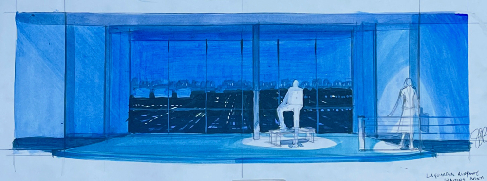
The joy of all this is that no moment of life is without visual or tactile sensation. Even a “tedious” wait in an airport waiting lounge sends me off on musings about upholstery, dress, luggage, human spatial needs, scale and color. “United Airlines blue “ used to endlessly fascinate me. In the most literal sense, no moment in life is wasted. On the new play Sylvia I was called frantically about an added scene: a LaGuardia waiting lounge. That design popped out whole in about 20 minutes.
Enlarge
ORIGINAL SKETCH BY JOHN LEE BEATTY
But watching and seeing are unending and never stop. I have even pulled up my shirt sleeve to show a painter the perfect blue purple of a bruise on my arm. And that little yellow halo around it. Fascinating. Did it hurt? I don’t remember, I was just trying to achieve a lost color I had seen. A painter once reminded me that all the colors in Proof came from a favorite sweater I was wearing.
Enlarge
ORIGINAL SKETCH, RESEARCH, AND SET PHOTO BY JOHN LEE BEATTY
One of my happiest designer memories was while visiting lighting designer Craig Miller in Santa Fe. As others around us were partying, we went out to the driveway to observe the vivid New Mexico sunset. On impulse, we took turns describing step by step and by name the colors transitioning from the red orange horizon to the deep blue skies above. There were possibly twelve or more colors, and we took turns naming them, like repeating a rosary, and going back to start again and again. How you get from bright orange to deep blue, fascinating, one of the joys of having a designer’s eye.
So much serious fun, and to share it with other designers.
