

I designed new plays, many, many new plays. It was exciting and sometimes dangerous, to be trusted to create a new theater experience. There was no template of previous production, and sometimes the play or musical would not be completely written before I had to design it.
Early on, as a summer stock designer, one would base one’s designs and ground plan closely on the original production. This might be true even in regional theater or at the outset of a Broadway revival.. Following the original production was expected, as it was necessary to make sense of the printed script’s stage directions and fulfill the intentions of the original production.
But that is not how one receives the script, or partial script, of a new play.
It was to be my joy to grow up to become the one who defines the play by the original production. I should have realized by my English literature background that I would become interested in new plays, and plays in general. I had started by designing musicals, but fell into Circle Repertory and the Manhattan Theater Club when I came to New York and I was fascinated by the dangerous world of new works.
The description of the set you read in a published script most often doesn’t exist, at least not fully, when I first read a play to design. When I started out, the ground plan of the original production was printed in the back of the published script, sometimes even a partial photograph of the set appeared, and one referred to these photos and ground plan to design a new production. This no longer happens for legal reasons. Not that designers don’t copy the original production. I should be quite flattered to see the number of copied versions of Other Desert Cities, Burn This, or Talley’s Folly when I run across them. I take joy in the fact that on a new play I create the ground plan and a visual design that defines the piece for the future. When I receive a new play to design however, there may be no set description at all, or the play might be confusingly unedited, or the set even described in a way that might not work on stage.
Below are some examples of plays defined by their design, as they move to Broadway.
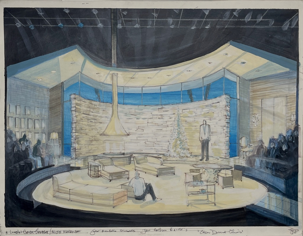
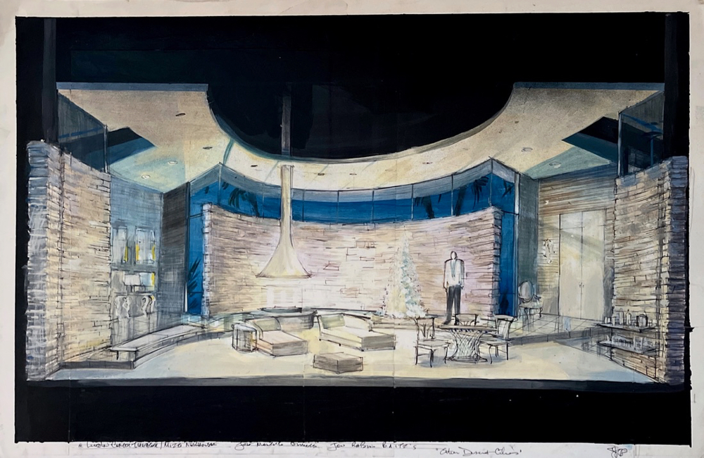
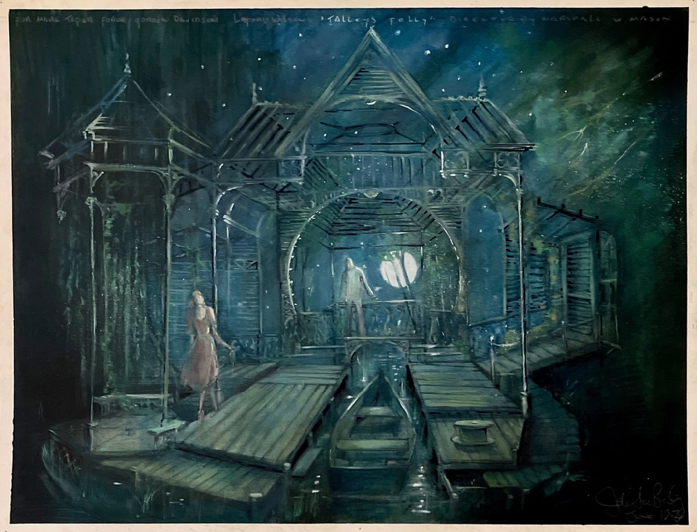
Other Desert Cities - Original Thrust at the Mitzi Newhouse. Other Desert Cities in Proscenium at the Booth Theater on Broadway. Talley's Folly in Proscenium at the Brooks Atkinson Theater on Broadway. Talley's Folly in Thrust at Mark Taper Forum.
I read a new play once, the first time not thinking about the scenery at all. I read the play as a piece of literature, trying to keep the characters straight, going for the meaning. Since I was an English literature major at Brown University, I am amused by some of the mis-spellings of some great playwrights, but I realize playwrights are hearing the words in their heads, not preparing a novel to publish. Sometimes there is a missing page, or a mis-numbering. For my own amusement I sometimes put a red ‘sp’ in the margin, as I always thought I was destined to be a high-school English teacher, my lifelong interest in scenery aside.
Some new plays are a fun read. Proof by David Auburn was so much fun that I was speed reading through the second act with one hand on the phone to call in my acceptance of the job the minute I turned the last page. Only four characters and one setting, it was easy to keep straight what was happening. I had no idea about the set at all, I just was appreciating the play. After accepting I read it again to start to think about the set.
Other new plays can be pasted-together scripts with great inconsistencies or have details hard to keep straight in your head. The time jumps in Lynn Nottage’s Sweat were really hard to keep straight. One character’s face tattoos presence or lack of presence told time passage so much that at the make-up free early reading, the play’s timeline was still extremely hard to follow. In production, even with the face tattoos added, we found we needed to project dates on the set, just to clarify when the scenes were taking place.
At first I was lost reading the play and the information of time was so important, so we added dates.
Enlarge
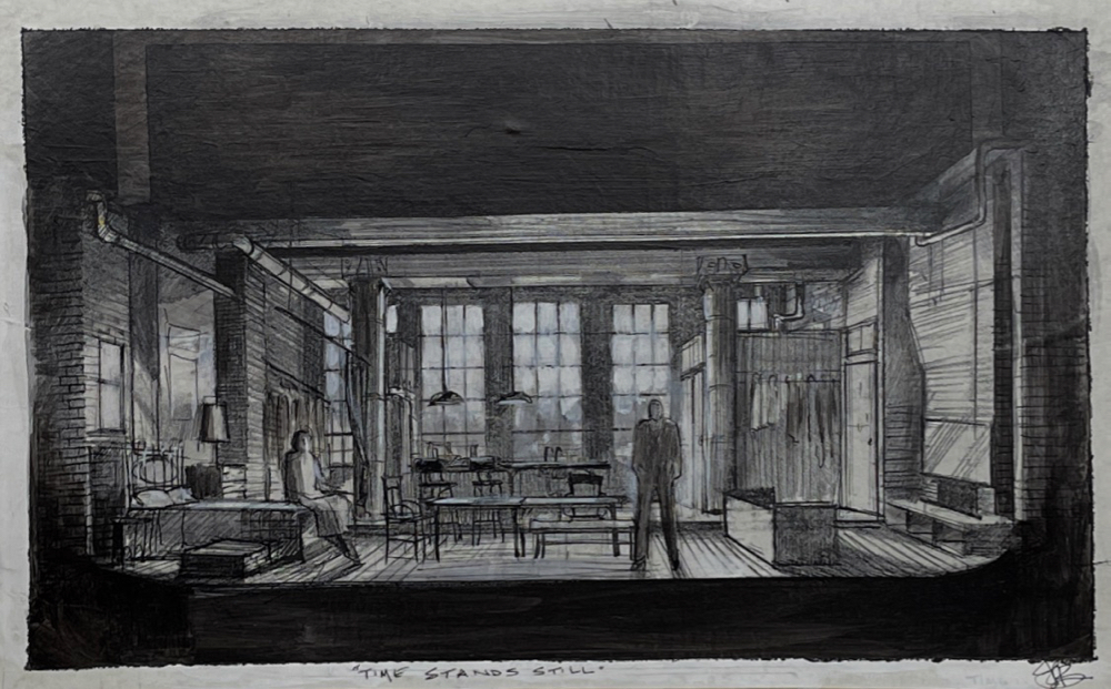
A reading though, can turn into a design session for me. Hearing an early reading of Donald Margolies’s Time Stands Still, the voice of Laura Linney told me all I needed to know about the photographer she played and what kind of studio she would live in. A set came out fully realized from her intelligent reading of the work.
Enlarge
Usually, if I understood my first reading, I go on to a second read at which point I turn into a set designer. This is an investment into understanding how the play is constructed. I take notes and flag odd occurrences (a thunderstorm), or inconsistencies (they came in stage right from the garden, but said they were upstairs). This charted breakdown I take to the director for us to figure out how to stage the play. I never show this work to a playwright, as they would be horrified at my skeletal breakdown of their play into plain old details of construction. Even the best of plays look pretty sad in this kind of nakedness. It is at this point that some flaws or organizational madness show up. In the case of John Patrick Shanley, three plays of his had the oddest left/right construction, with their multiple alternating scenes left–right–left– right–left–right–right–left–right, making it impossible to shift sets consistently alternating left side to right side, forcing the designer to come up with another shift scheme. With Wendy Wasserstein, a scene might start in a garden and end up in a dining room with no explanation between. Some authors do attempt scenic solutions, but that usually makes my job harder. Descriptions of scrim walls betray an author’s indecision about what really needs to be seen. Worse yet, descriptions of simple platforms never take into account how actors and props are to access these pristine platforms, and sometimes more accurately indicate that the author wants the play to be ‘simple’ enough to attract a producer with a tight wallet.
Sometimes I would get an inkling of what the author saw in their head. Arthur Miller’s The Last Yankee was to premiere at Manhattan Theater Club in a small thrust stage. I could feel instinctively by his descriptions that he subconsciously imagined it in a wide proscenium space, making any set I came up with oddly awkward and overly present. The characters would be better off speaking twenty feet apart, rather than five. Understandable, Miller being a Broadway playwright, that he imagined it in that scale, but hard for the designer to reconcile Miller’s vision to a smaller space.
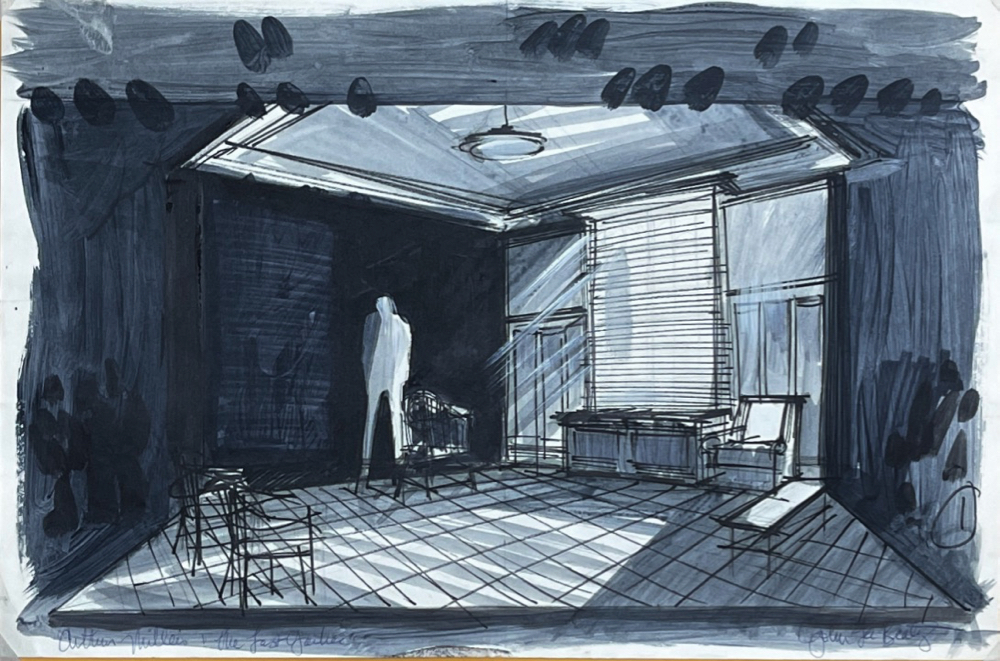
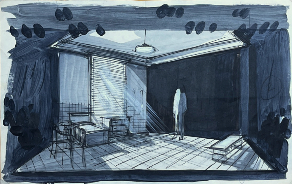
Set sketches "The Last Yankee" Manhattan Theater Club, Stage 2 small thrust stage.
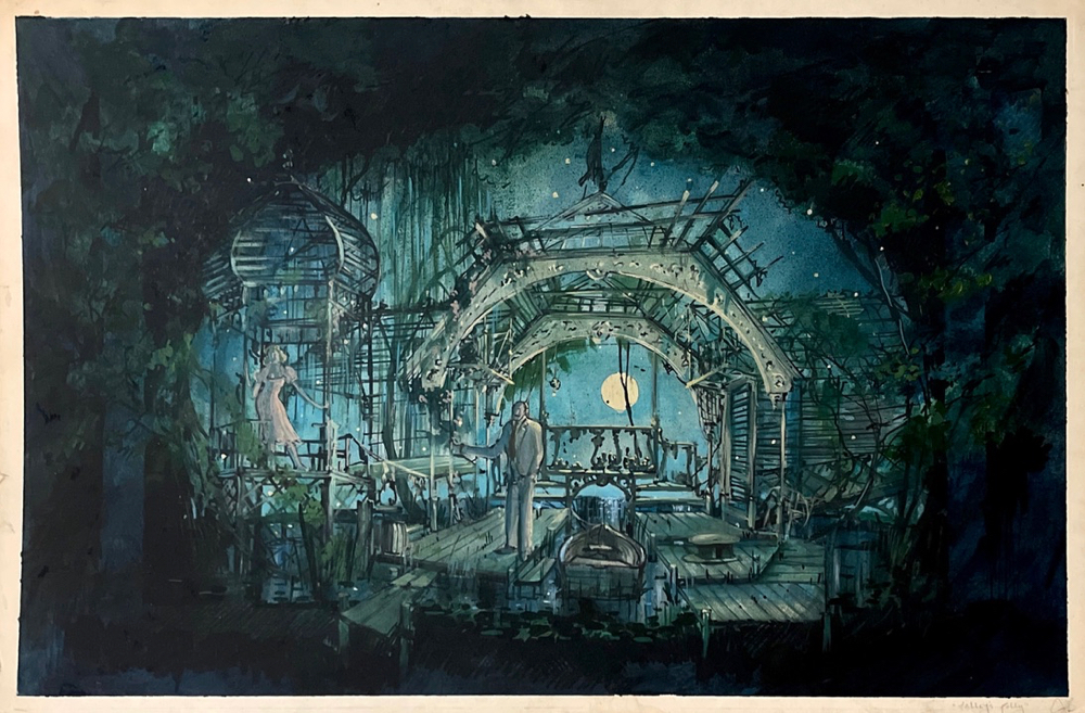
For designing new plays, many of my favorite experiences were working on the Lanford Wilson plays. The first information was word there was a new play, then months later a vague description of what the subject was, then later a vague word about its setting, then later still, the actual script. No set description, or just a few words like “moonlight through broken shutters” in Talley’s Folly. The set would evolve through general emotional feeling then into the nuts and bolts of practicality, for example I said to the director, “Wait, Matt mentions to Sally breaking a canoe!” A breakaway canoe was added. Oddly and sweetly, the physical requirements would be easy to fulfill as we went from the general to the specific, from the core feeling to the details.
The rhythm of the play becomes incredibly important to the director and me. In a play with many scene changes, my scheme of scene shifts cannot slow the progress of the play or its intrinsic rhythm can be lost. How to discover that rhythm? Get up and move around reading the words. Or better yet, turn the pages of the script sideways and analyze the pattern of the printed sentence lengths. A snappy comedy looks like a sawtooth mountain range with no plateaus. If it looks like alternating blocks, find a way to focus the eye on an actor who has to stand, or sit, and deliver monologues.
Of course one of the scary, dangerous parts of designing new plays and musicals is that entire sections may be rewritten and scenes might completely disappear. Sometimes power saws are involved in removing unneeded scenic elements. Sometimes a comedy isn’t funny, sometimes a drama isn’t dramatic enough. Sometimes a drama is a lot funnier than first reading would indicate (See Fifth of July described below.) Sometimes there is a very sad ending to one’s dreams. But on the other hand, there is for me a wonderful moment when the play and the design become wed and we see what a new play actually is. A play is not on the page, it is that thing which an audience witnesses when all the elements, including scenery, come together. A good new play, risen up and on the stage, is an event now and also for the future.
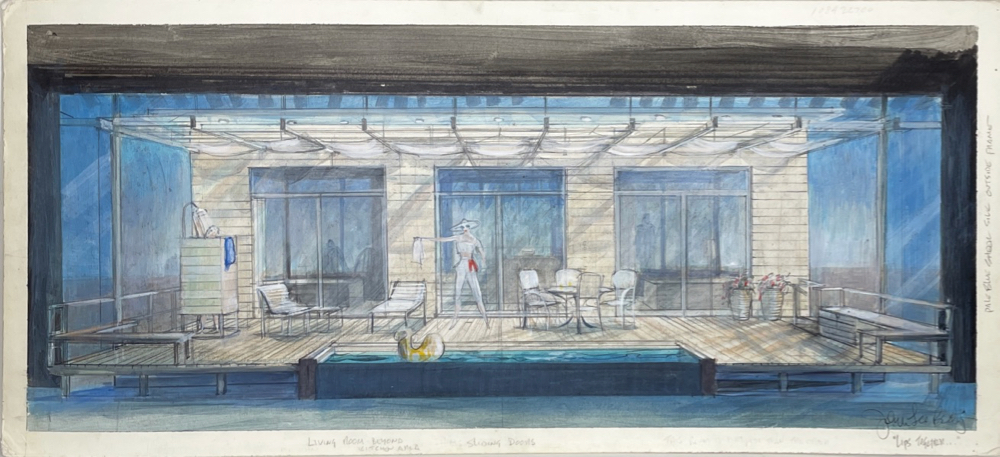
Sometimes the design affects the content of the play. Terrence McNally’s Lips Together, Teeth Apart had many many requirements. A swimming pool, a deck with an onstage shower, a kite, a barbecue, deck furniture, table for four, an easel, views of two bedrooms, a kitchen, and a tool shed. I got all grown up and said that the tool shed had to go. It was used once in the first act then never again. I believe I said the bulky shed was going to look like a dead elephant in the midst of the proceedings. That huge shed became a small lock box brought to the table. Because I see a set in my head, I realized the shed was the one piece that had to be expendable. Terrence also relocated the setting from the Hamptons to Fire Island after I started my work, but thank God I had briefly visited a friend’s house on Fire Island just weeks before, as we were moving fast to production. That was the research! Terrence wanted simplicity, but he hadn’t written it.
Enlarge
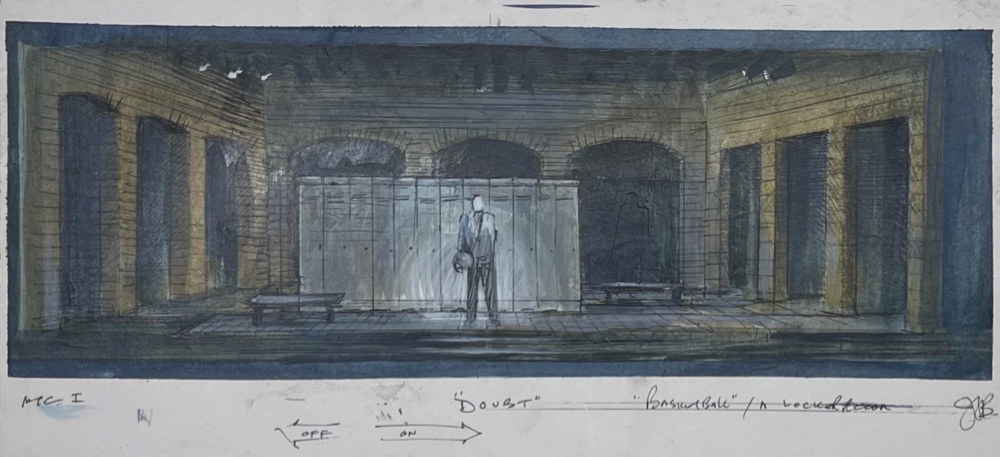
On John Patrick Shanley’s Doubt, I could see that one scene set in a gymnasium basketball court didn’t match the scale of the other scenes. The solo speech of the priest would be impossible to light except as a cheat in a vaguely wrong-sized basketball court. I changed the setting of the speech to in front of a wall of gym lockers, with the rest of the locker room space implied. It was easy to focus lights to isolate the priest against the lockers, but it also added a double creep factor, as you realize he is speaking to a room of half-dressed boys. The scenery becomes content.
Enlarge
__________________________________________________________________________________________________________________
Most fun to watch was the evolution of a ‘practical’ usable fire escape I instinctively provided for the first production of Lanford Wilson’s Burn This. Not called for in the script, I silently provided the scenic fire escape to the director and actors. During our first tech rehearsals, John Malkovich eyed the fire escape, then intuitively crawled out onto it and discovered a desperate moment for his character. The director Marshall W. Mason and the playwright Lanford Wilson lit up in understanding but also topped him. The fire escape moment became part of the direction and the text, and I was glad that I had helped create what was now called the ‘suicide scene.’ I had found that giving actors and directors possibilities in new material was very important to the work. Movement and inspiration come from the limitations and possibilities of the ground plan.
Enlarge
Often times the director and I will hatch schemes in order to ’emphasize the positive’ in a script. As a team we can make a play stronger by doing some clever shift of the eye. It is hard when a playwright directs their own play, even harder when they are in it as well. Athol Fugard, in Road to Mecca was all three, and his girlfriend did the costumes. There was no one left to talk to openly about the script.
There is often a basic conservatism asked for when doing a design for a new play. A radical interpretive approach isn’t usually wanted the ‘first time around.’ Neil Simon didn’t want what he called “anything weird” to distract from the script. One tries to put onstage what is in the playwright’s head—almost diagnostically to see what it is that they have written. The ‘high concept’ production usually comes the second or third time around of mounting the play. Then there is the benefit of hindsight in knowing what the script actually was or became.
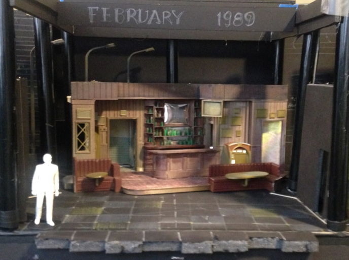
Of course once on stage, rewritten or unfinished scripts leave the design with unexplained features remaining. A new Neil Simon play lost an entire setting during the tryout in Boston. A no longer important tree had to be chopped down and replaced with a garden of daffodils. While in rehearsals for Mound Builders Lanford said his still unfinished Act Two would have a climactic flood onstage. By the time he actually wrote the second act the flood occurred far offstage, yet the floating detritus of the designer’s flood was left marooned onstage.
__________________________________________________________________________________________________________________
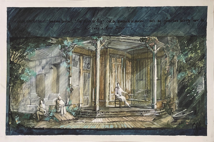
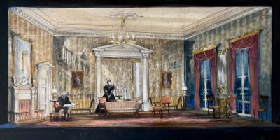
Fifth of July, when I designed it, was called Regarding the Bosom of Abraham
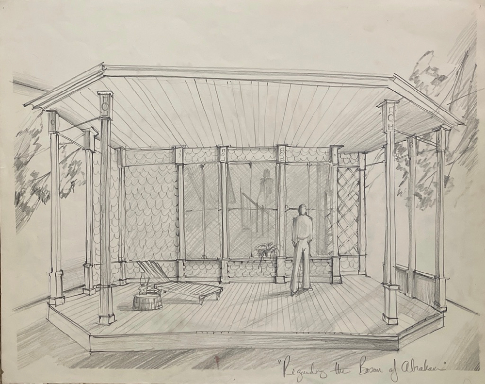
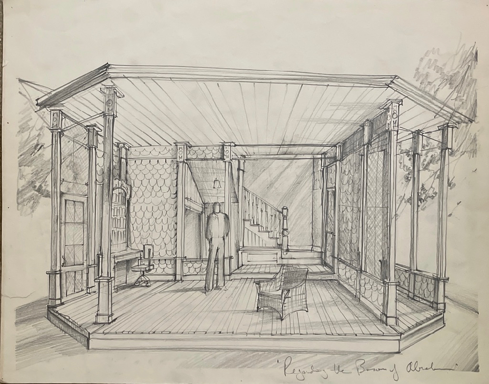

The Fifth of July - Initial Sketches From Off Broadway and Final Sketches of the Broadway version
Lanford Wilson’s Fifth of July was called Regarding the Bosom of Abraham when I began. The pencil sketch shows the off-Broadway premiere version without color.
Each act has a different setting in the Talley house, now known from the Talley trilogy of plays Lanford eventually wrote. As there was no backstage in our black box theater, the set was switched from inside the Talley house to the porch just beyond by changing what are called ‘plugs’ — various panels — in this case shingles and screening, all aged in silvery gray. As ever with these Talley plays, the slightly ruined mid-western mansion was a major element of the play’s American themes.
The set, like the play’s title, was to change its nature …
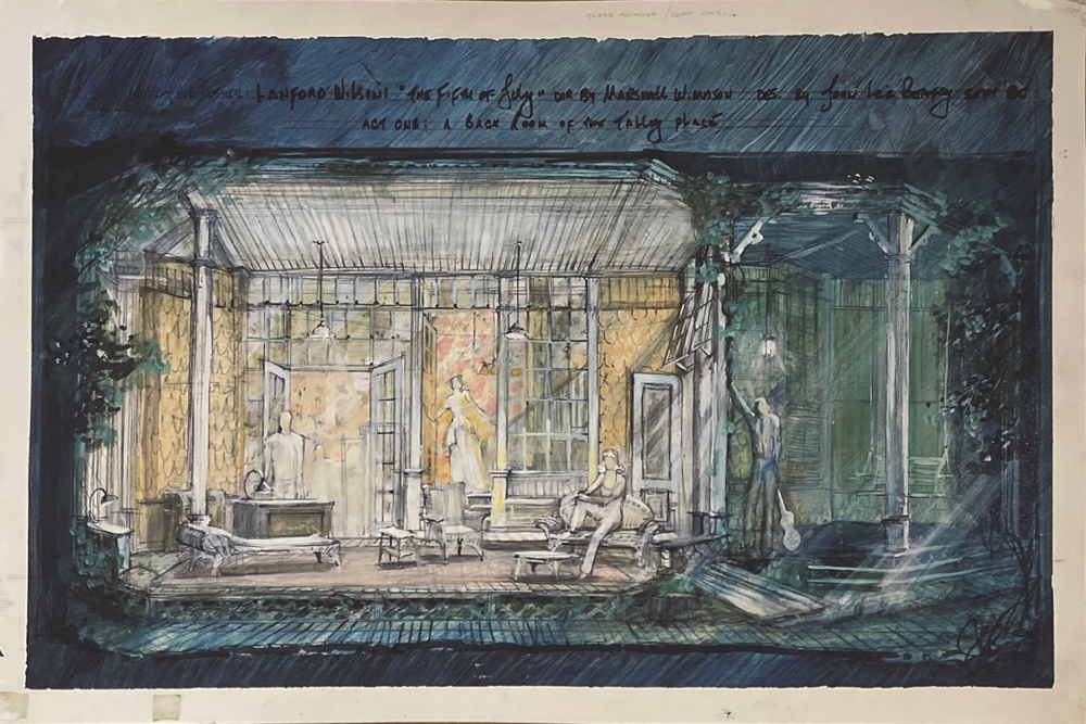
The first preview told us that the gray set didn’t quite match the often surprising eruption of laughter. New plays are always defining themselves. Fifth of July was no different. It was a comedy as well as a drama. I remember talking about the tonal shift the play was taking with Marshall W. Mason our director, our playwright Lanford, and the actress Helen Stenborg (future director Doug Hughes’ mother, though she curiously resembled my own with her cheerily pointed remarks.) We decided that something must be done to the set to allow the play to breathe more comfortably. We had nailed the wistful loss part of the show, the set succeeded there, but it needed another quality as well. I rushed out to search Lower East Side bargain fabric stores and came back with a large remnant of yellow striped chintz that I transformed into ‘old’ wallpaper and actually put it up myself. I pulled up the tone of the paint with more lively highlights, and the second preview went on. The play, an audience favorite, was finding its way.
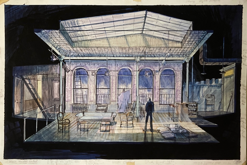
The Broadway version of Fifth of July is totally different. By this time, this being the third Circle Rep show to make it to Broadway, the director and I had learned to change the design to ‘save’ the initial design impulse. The requirements of Broadway meant building an entire rolling unit that moved as one on a curved track, using only one stagehand to press a button on an electric motor to change the entire set from inside to outside. The change was made behind the house curtain at intermission. During the curtain call we revealed the exciting scene change; the thrilling movement was too “showy” for the body of the performance.
Marshall W. Mason’s clever and naturally motivated blocking made what I had thought was a fault in the second act ground plan into a virtue. The dominating white column holding the roof meant all blocking was compromised in focus as all movement was in relation to the column. Marshall figured out that the actor sitting in front of this white column would always take focus. Christopher Reeve (our newest film star playing the gay paraplegic Vietnam war veteran) when placed at the column, ‘took stage’ without effort—after all a big white arrow was pointing to him! All the action revolved around Chris and the column, thanks to Marshall’s inspired blocking.
Enlarge
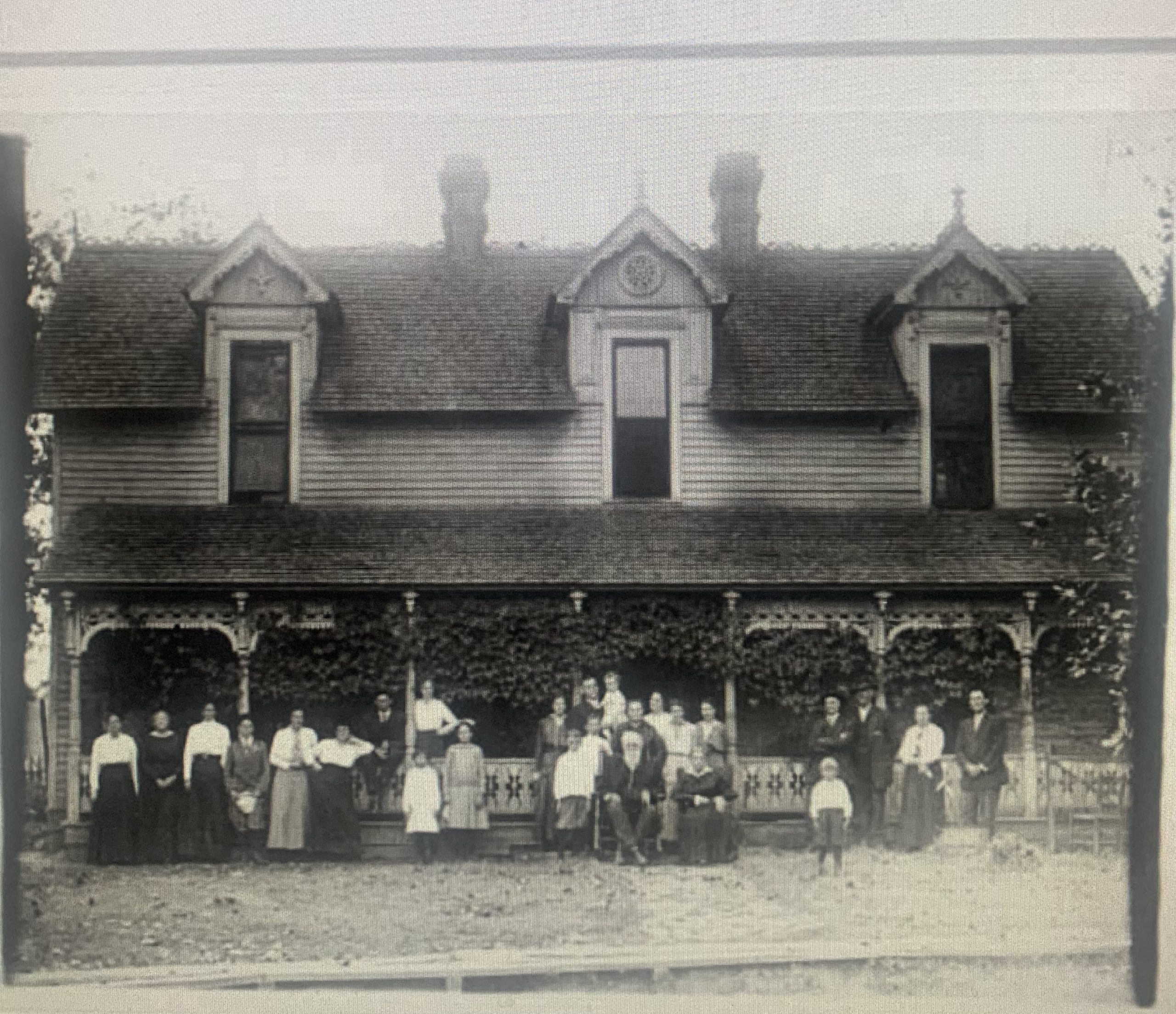
The Talley house itself was a combined memory of the architecture of my father’s small town Tennessee background, which I remembered from childhood, and also the screened sleeping porches of the old houses I grew up in in Southern California. All places dripping with rowdy vines grabbing onto painted shingles. In fact, all the Talley settings owed their look to these sources.
I created a third design for Fifth of July when it played in repertory with Talley’s Folly in Los Angeles. But I tore up the sketch of that one in the rent-a-car lot at the airport on my way out of L.A. Helen Stenborg had told me this altered version of the set wasn’t up to my usual work. I am not supposed to take notes from actors, but she was my ‘mother’ after all … so into the parking lot trash can the sketch went.
